圣杯布局和双飞翼布局都是平时开发中比较常用的页面布局,两者核心都一样,本质上都是三栏布局,此文记录自己平时对圣杯布局的实践。
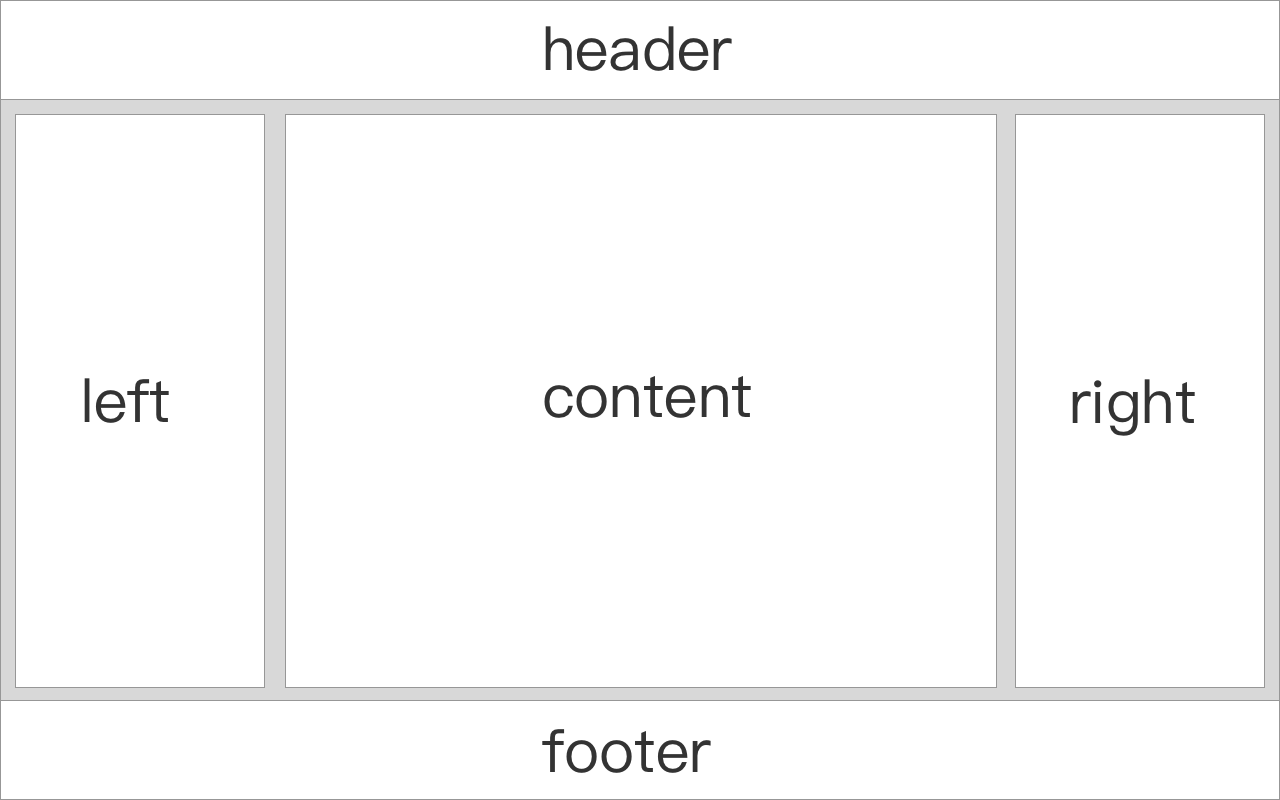
圣杯布局题图所示,传统布局要求内容部分左右两侧定宽,中间部分自适应宽度,整体主要结构包括
1. float
 1
 2
 3
 4
 5
 6
 7
 8
 9
10
11
12
13
14
15
16
17
18
19
20
21
22
23
24
25
26
27
28
29
30
31
32
33
34
35
36
37
38
39
40
41
42
43
44
45
46
47
48
49
50
51
52
53
54
55
56
57
58
| <!DOCTYPE html>
<html lang="en">
<head>
<meta charset="UTF-8">
<meta name="viewport" content="width=device-width, initial-scale=1.0">
<meta http-equiv="X-UA-Compatible" content="ie=edge">
<title>CSS圣杯布局</title>
<style>
* {
margin: 0;
padding: 0;
text-align: center;
}
body {
/* 左右定宽时,为保证页面显示,设置最小宽度 */
min-width: 600px;
}
.header,.footer {
height: 60px;
width: 100%;
background-color: #F1F1F1;
line-height: 60px;
}
.content {
overflow: hidden;
}
.content div {
height: 600px;
line-height: 600px;
}
.middle {
background-color: #DDD;
}
.left {
float: left;
width: 200px;
background-color: #CCC;
}
.right {
float: right;
width: 250px;
background-color: #CCC;
}
</style>
</head>
<body>
<div class="header">header</div>
<div class="content">
<div class="left">left</div>
<div class="right">right</div>
<div class="middle">middle</div>
</div>
<div class="footer">footer</div>
</body>
</html>
|
2. flex
 1
 2
 3
 4
 5
 6
 7
 8
 9
10
11
12
13
14
15
16
17
18
19
20
21
22
23
24
25
26
27
28
29
30
31
32
33
34
35
36
37
38
39
40
41
42
43
44
45
46
47
48
49
50
51
52
53
54
55
56
57
58
59
60
61
62
63
64
65
66
67
68
| <!DOCTYPE html>
<html lang="en">
<head>
<meta charset="UTF-8">
<meta name="viewport" content="width=device-width, initial-scale=1.0">
<meta http-equiv="X-UA-Compatible" content="ie=edge">
<title>CSS圣杯布局</title>
<style>
* {
margin: 0;
padding: 0;
text-align: center;
}
.header,.footer {
height: 60px;
width: 100%;
background-color: #F1F1F1;
line-height: 60px;
}
.content {
display: flex;
}
.content div {
height: 600px;
line-height: 600px;
}
.middle {
flex: 1;
background-color: #DDD;
}
.left {
width: 200px;
background-color: #CCC;
}
.right {
width: 250px;
background-color: #CCC;
}
/* 加入响应式布局 */
@media screen and (max-width: 800px) {
.content {
flex-flow: row wrap;
}
.left,.right,.middle {
flex: 1 100%;
}
.content div {
height: 100px;
line-height: 100px;
}
}
</style>
</head>
<body>
<div class="header">header</div>
<div class="content">
<div class="left">left</div>
<div class="middle">middle</div>
<div class="right">right</div>
</div>
<div class="footer">footer</div>
</body>
</html>
|

